Experience user and improvement conversions: when site not only looks good — but also brings results
Sometimes it not the design. The site looks good, everything “like that needed”, there is entrances – but the results?
Not arrive.
Client one came to me with site invested: animations, colors, videos. But percent the conversion? 0.7%.
He asked: “Can to be that people simply not understand what I offer?” The answer was: yes. The problem not was in design. But in way that in which the site spoke with the users.
Imagine visitor that enters to site. There is to him 5 seconds to understand where he, why worthwhile to him to stay – and what you offer. If he not receives answers – he moves forward. Not because you not good. But because it not was clear.
In average, sites that not adapted to UX and CRO lose 70–80% from the potential of theirs. It not question of design — this question of structure, flow, and texts correct.
UX this how that the user feels in site. CRO this how much people leave details or buy.
In project to company SaaS international we changed: – structure page the home – micro-copy in button – order the appearance of the contents
Within two weeks:
🔺 rise of 38% in rate the conversion
🔺 time that was in site rose by 27%
🔺 drop of 22% in abandonment in page the first
It not magic. It to understand what the user really needs in order to feel safe. When you help to him to understand, to choose and to act – he acts.
Projects selected
In every project there is story - of challenge, of goal, of change.
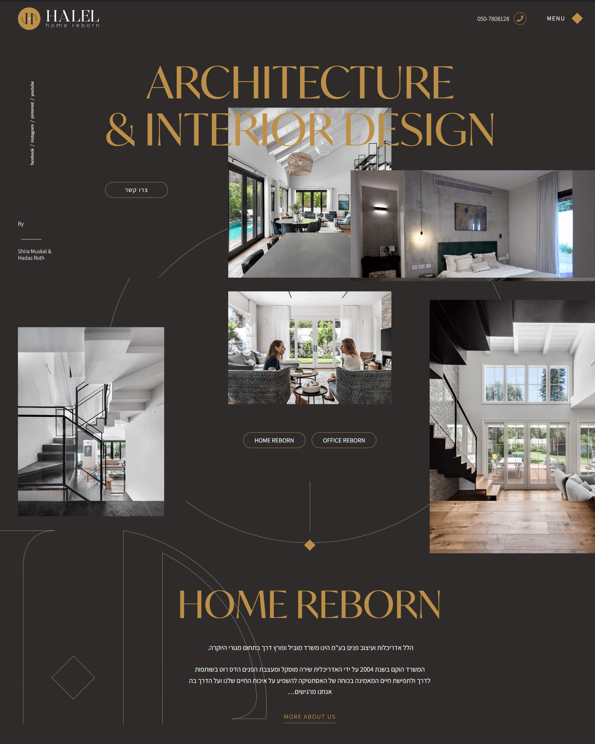
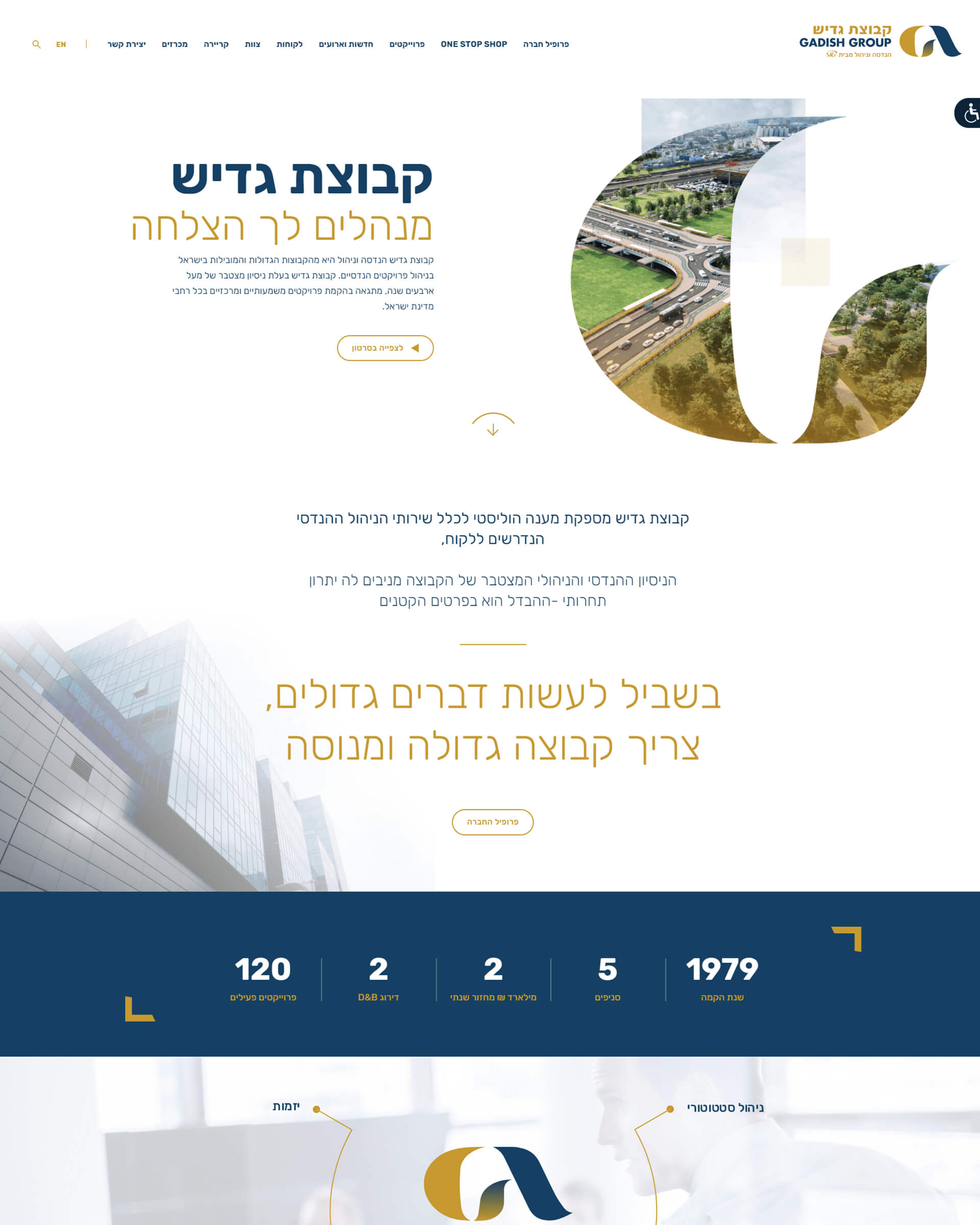
Here you will find collection of works that show what happens when experience user meets understanding business.
Sites that built not only in order to look good, but in order to work: to produce leads, to motivate to purchase, to explain within seconds what the product of yours worth.
Invited to peek, to ask, to mark to yourselves what works.
And if something here speaks to you - we will speak about how do the it also at yours.
